Heatmaps
Heatmaps are a common tool for visualizing gene expression patterns produced by high throughput technologies such as microarrays. Here I demonstrate how to produce the following heatmap in R using the ggplot2 package.
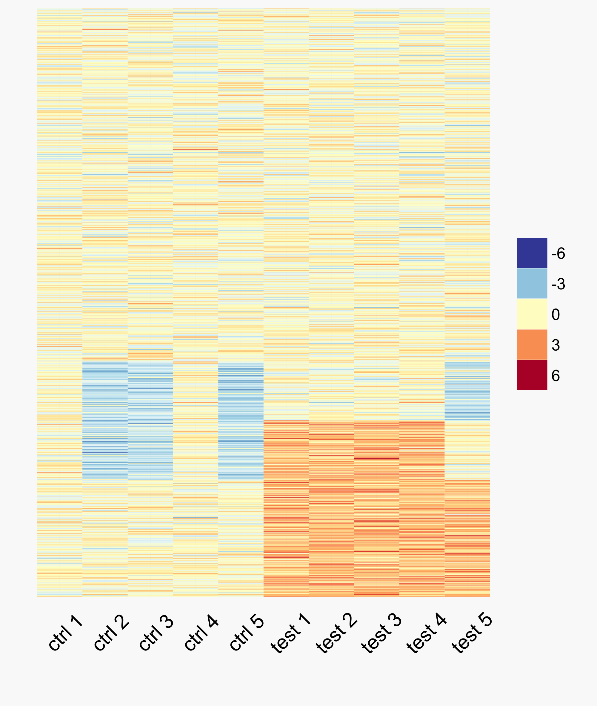
The colour scheme for this heatmap is colour-blind friendly and was developed based on how individuals interpret colour. To create the above heatmap, we first generate some example expression data:
# random matrix of expression values
y <- matrix(rnorm(10000), nrow=1000, ncol=10)
colnames(y) <- paste(rep(c("ctrl", "test"), each=5), 1:5)

# add some signal
y[1:300, 6:10] <- y[1:300, 6:10] + 2
y[200:400, c(2, 3, 5, 10)] <- y[200:400, c(2, 3, 5, 10)] - 2
Before plotting the data, we must first melt it into the format that ggplot2
expects (see tidy data). We then plot and save the resulting image using ggplot2.
library(ggplot2)
library(reshape2)
library(RColorBrewer)

ym <- melt(y, varnames=c("gene", "sample"))

# get colours from a red-yellow-blue palette
pal <- colorRampPalette(rev(brewer.pal(11, "RdYlBu")))

ggplot(ym, aes(y=gene, x=sample, fill=value)) +
    geom_tile() +
    scale_fill_gradientn(name="", colours=pal(100),
                         limits=c(-6, 6), guide="legend") +
    theme_minimal(base_size=9) +
    scale_y_discrete(breaks=NULL) +
    xlab("") + ylab("") +
    theme(axis.text.x=element_text(angle=45, size=9))

ggsave("heatmap.svg", bg="#f8f8f8")